Electric Rates By State
I was talking with my mother-in-law the other day, and we were wondering what the highest electric rates in the country are. The US Energy Information Administration does an excellent job of collecting this information and displaying it in tabular form on their website. Click here to see what the answer is for the latest month. However, there is enough data in that table that it took me a minute to skim through, understand every row and column, and understand the answer to our question. I felt like this data set deserved a better visualization, so I created it.
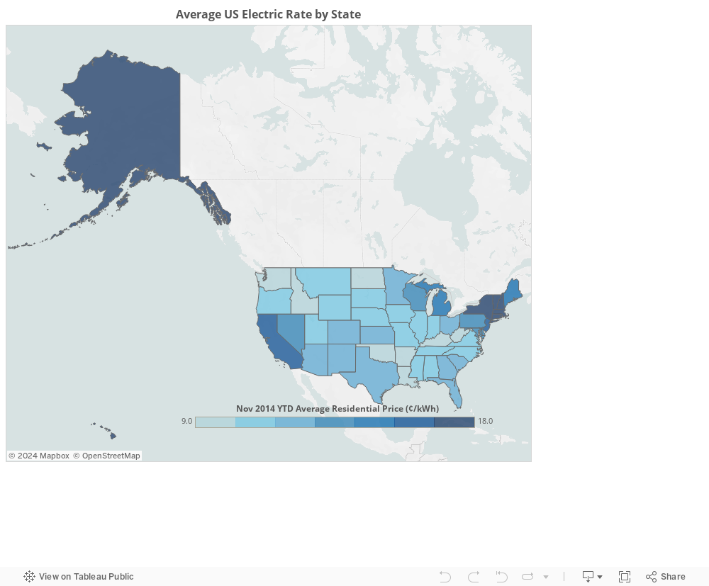
I was surprised by both the state with the highest and the state with the lowest electric rates. Hawai’i has by far the highest average electric rate, at 37.6 ¢/kWh, and Washington State has the lowest rate, at only 8.8 ¢/kWh.
###Per Capita Energy Usage
The US EIA also provides a trove of data on many different parameters. I was then interested to find out who spends the largest fraction of their income on electric. The US EIA does not provide that information directly, but they do publish the total retail sales per state.
The US Census Bureau publish another excellent data set tabulating
the estimated population per state per year. I combined these two data sets
using pandas in Python (see bottom of post for details),
and the resulting average per capita energy use by state can be seen below.
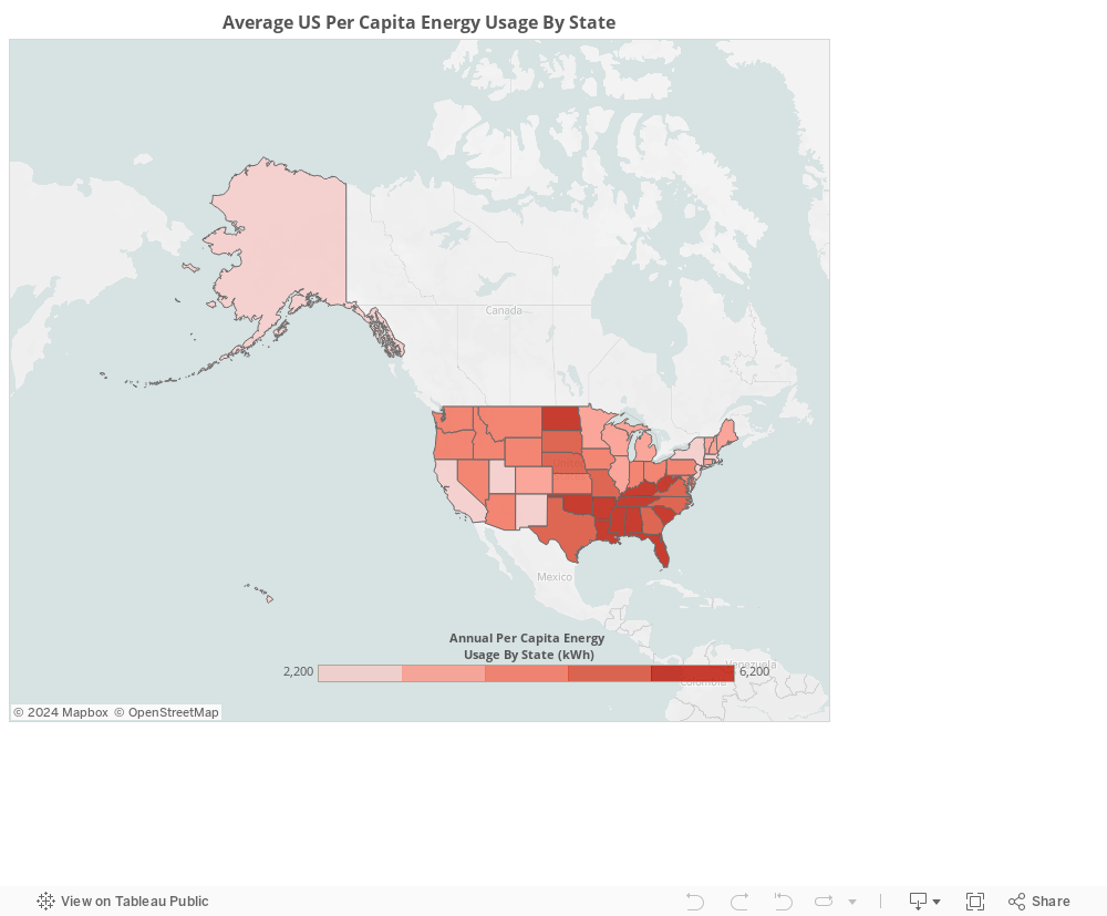
It’s interesting to see that the states with some of the highest energy prices use the least amount of energy, and some of the states with the lowest energy prices use the highest amount of energy per capita.
I later realized that the US EIA does indeed provide information on the average amount spent per customer by state, but not the average amount spent per capita by state. They calculated that the average Hawaii resident customer uses the least amount of energy and the average Louisianan customer uses the most energy. This qualitatively agrees with my findings, but I calculated the result per resident (not per customer like the EIA). The average customer purchases a lot more energy than the average resident uses. This makes sense since more than 1 person lives in the average household.
###Percent of Income Spent on Electric
The next question I would like to address is what is the fraction of income that is used towards electricity by state. To answer this I used the results from the above analysis in addition to the Annual Social and Economic Supplement Current Income of Households by State Using 2-Year-Average Medians from the US Census Bureau, which can be downloaded here.
The percent of income spent on electric was calculated by taking the average per capita energy use by state, multiplying it by the average persons per household in the US (retrieved from here), multiplying that by the average residential electric rate by state for 2014, and dividing by the 2012 - 2013 2-Year Averaged Median Household income. If you prefer mathematical notation, that is
\[
 f_{I} = \frac{E_{C} H_{p} R_{E}}{I}
 \]
- \(f_{I}\): fraction of income spent on electric
- \(E_{C}\): Average energy usage per capita by state (source)
- \(H_{p}\): The average persons per household in the US (source)
- \(R_{E}\): The average electric rate per kWh by state (source)
- \(I\): The median household income by state (source)
Below is the result.
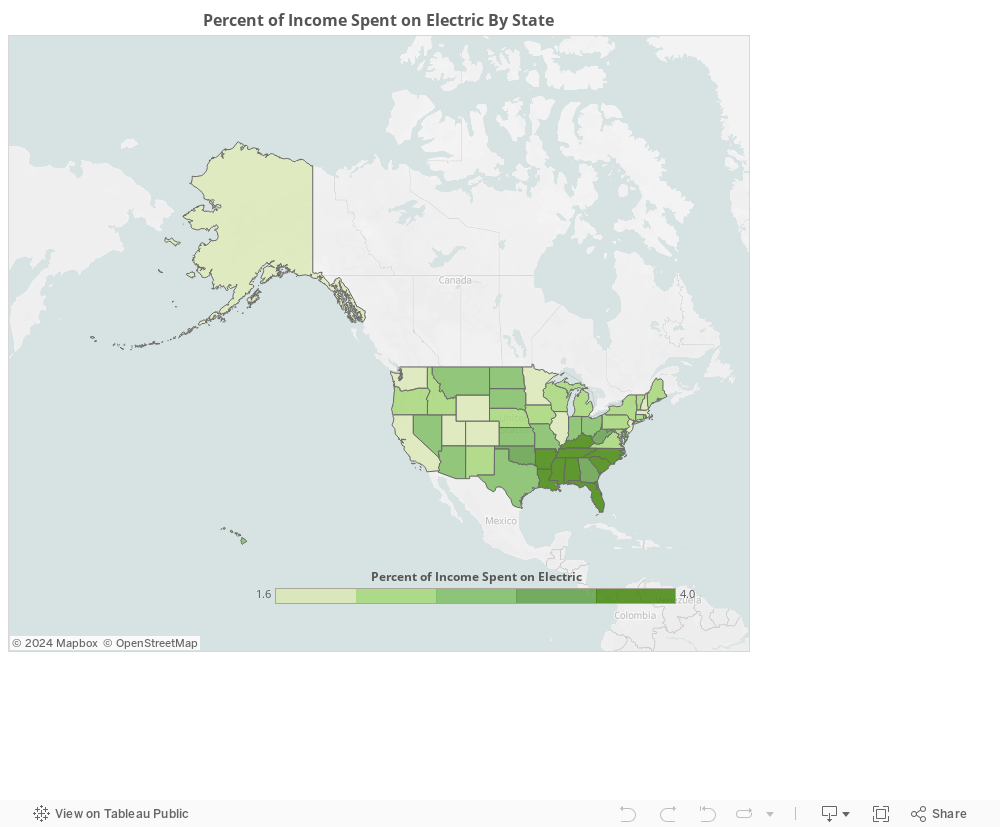
This shows that despite having some of the lowest energy rates in the country, a combination of the lowest median annual income and the highest energy usage has driven many southern states to spend the highest fraction of their income on electric. Mississipians spend the most on electric, at 4.5 % of their income, and Utahans spend the least, at only 1.3 %.
###Appendix
All of the code and data used to create this blog post can be found in my github repository on energy consumption in the United States. Furthermore, the Tableau workbooks that I used to create the above illustrations can be downloaded for my Tableau public profile here.